Some people call me an OG of wedding business marketing, but deep down I'm just another person wearing PJ bottoms on Zoom. I swear a lot, I share my struggles, and I don't pretend to be better than anyone else.
a marketing and business nerd who fell in love with the wedding industry.
Hi, I’m Heidi
4 Small Website Tweaks That Make A Big Difference [Day 7: 30 DBWB]
[This post is an excerpt from the 30 Days To A Better Wedding Business Workbook]
It’s surprising how powerful small tweaks can be. These 4 tweaks don’t take long to implement but they make a big difference in your business.
1. Change “brides” to something more gender neutral unless you only deal with brides
According to a report on milennials by Think Splendid, “The biggest mistake in losing the sale is focusing just on bride. 65% of grooms are involved & decisions have equal weight.”. Don’t neglect 50% of your potential clients!
2. Change “I” to “you”
Does your website read like this? “I studied for years, and I won this award and I shoot weddings in this particular style”? If your website contains lots of personal pronouns like us, me, we, I and our then your business has “Me, Me” Syndrome but there is hope.
Your content needs to pass the “What does that mean to me?” test. When you write, put yourself in your customer’s position and question every sentence with “What does that mean to me?”. What matters to you may not matter to them because they want to know what is in this for them. Make use of “you” and tell your audience what they will get from working with you. Speak to them, not at them.
3. Ditch the industry jargon
If you’re using terms like “reportage” on your website, I highly suggest you change that. Most couples have never planned a wedding before and aren’t familiar with wedding industry terms. This is known as the curse of knowledge-we take our own knowledge for granted and assume that everyone knows what we know. Put yourself in their shoes and make sure you’re speaking their language in your marketing materials.
4. Use CTAs
When someone reads your blog posts, website content or marketing materials, do they know what you want them to do next? This might seem silly but it is statistically proven that using calls to action (CTAs) get people to take action.
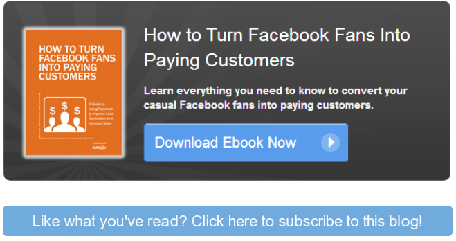
Calls to action are simply words that are used to get your prospect to take a specific action. Here is an example:
These two CTAs appear at the end of posts on Hubspot’s blog and are actually very easy to create within Microsoft Powerpoint. For a simpler CTA, just do a text version of these and link it to the relevant page.
Take a look at every page on your own website and think about what action you want the reader to take after they read it.
Leave a Reply Cancel reply
Based in San Diego, California / working with wedding businesses worldwide
